RocketSpace
phone_android Mobile Application, Android, iOS
RocketSpace provides speed and direction to the world's top tech startups and corporate innovators.
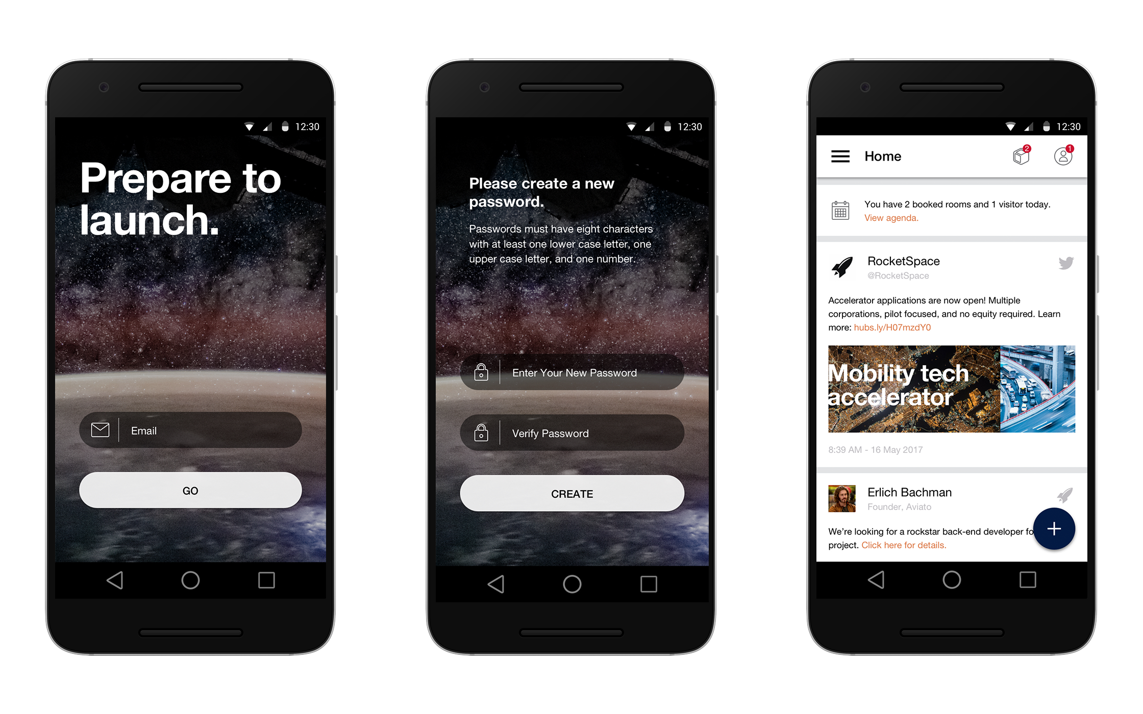
RocketSpace is an office-sharing startup incubator similar to WeWork. To coincide with the opening of their new London location I created an application for RocketSpace members to manage their visitors, events, and space reservations.
Problem
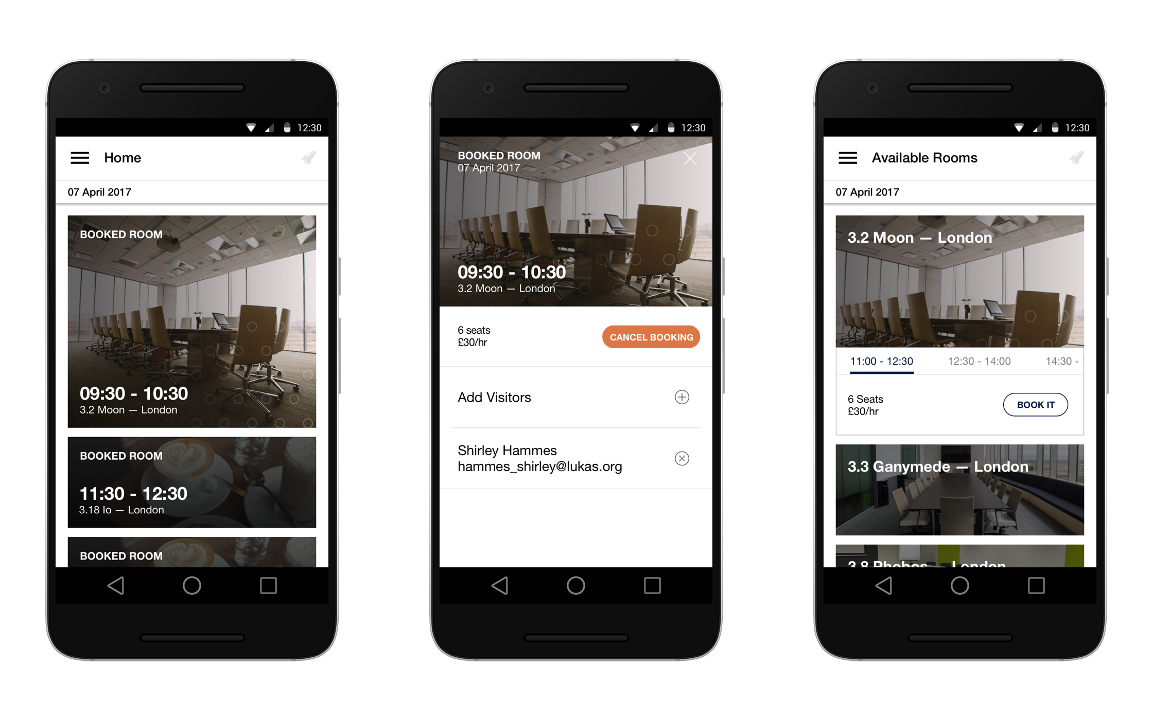
Prior to the project, RocketSpace members had to use the RocketSpace website to manage visitors and booked conference rooms. A mobile component was necessary in order to give members the path of least resistance.
RocketSpace also wanted to provide a "wow-factor" to match their future-is-now vibe. The mobile app would also act as members' access badge, and notifications would be pushed to them via geofence detection. Greetings! If you're at work today, there are burritos in the lobby.
Solution
RocketSpace wanted to target both Android and iOS markets. I focused primarily on the Android side, but there was parity between both platforms. We wanted to make the app experiences as similar as possible.
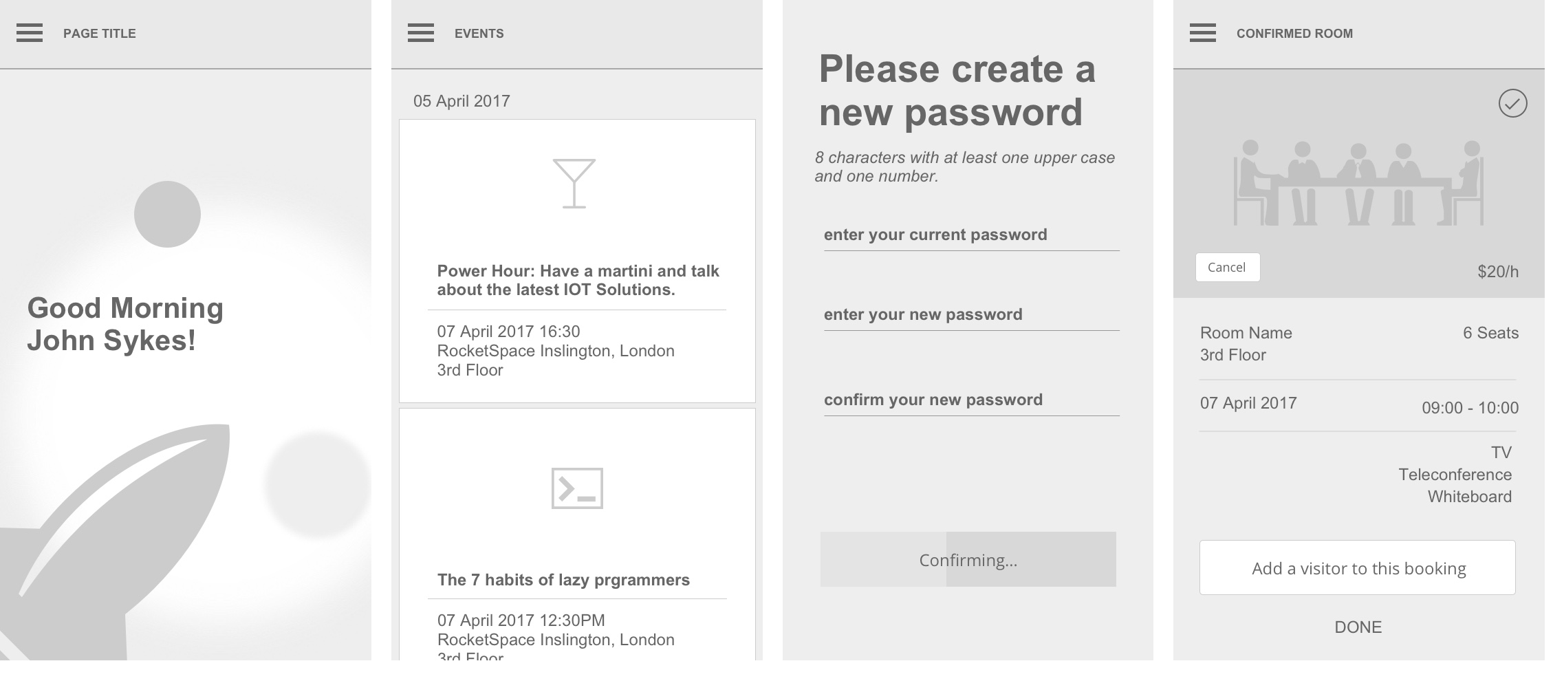
User experience design is fundamentally data-informed. We had the opportunity to run some usability studies on a prototype app on-site at RocketSpace in San Francisco, CA. Our target users were existing RocketSpace members who were using the facility as their primary office space. We had them run through a task analysis on a prototype we built out in Proto.io. Below you see some of our wireframe images we used for the prototype.
The feedback from the testing was invaluable. Some key insights were that using a rocket icon for the menu is unintuitive (we then switched it to the more standard hamburger icon) and 'My Agenda' is not an appropriate title for the home screen.
Iteration
It wasn't apparent until after we built out the prototype that we'd have quite a number of screen states to mock up for development. Because we had several user groups with different navigation requirements, a diagram was needed to keep all the states in order for development.
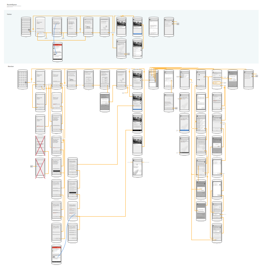
This was also our first time using a tool called Zeplin, which greatly streamlined the redlining process. We had over 150 screens, so doing redlines by hand wasn't an option given the time frame. Using Sketch with nested symbol artboards, we were able to maintain our IA diagram and the designs at the same time. My colleague wrote an article about the process on Medium.
User testing is not the only aspect that informs design. Collaborating directly with engineering is vital to knowing whether or not a feature is reasonable to build. Several iterations came directly from such developer input. One such example was the Search Results page-- as we had originally designed in the wireframes, each bookable conference room would appear in duplicate for each time slot it had available. However, in the case where a room is available for the entire day, the user would see pages and pages of a single conference room, repeated for every available time slot, which our developer was able to demonstrate to us. We remedied this issue by consolidating single conference rooms into single cards.
Finer details
I wanted the app to feel like a premium solution; a cut above the competition. Robust animations were key. Animations, when implemented correctly, help guide the user's attention, improve usability, and are visually pleasing as well.
Prior to the project I hadn't had extensive experience with animation. This was an opportunity for us to learn. Using tools like Tumult Hype and Adobe AfterEffects I was able to create the animations below.
The visual design went through several iterations based on the RocketSpace branding guide, but peppered with creative inspiration to transform some of the more static print elements into dynamic UI.
Release
Our app release coincided with the opening of RocketSpace's new London office in Q2 2017. Maintainence of the app post-launch was delegated to another Luxoft team based in Poland due to cost and less time differential.
The RocketSpace app is currently available on the Google Play and Apple App stores.

Ed Cortis
CTO, RocketSpace
"You all did an amazing job of delivering an MVP in just over 3 months on two platforms. An agile team sticking to its burn down from Sprint 1 and hitting the delivered date is a credit to your skill and passion - thank you."
More screens
Here are some more examples from the project.