T-Mobile Plans
web_asset Webpage
Plans are an essential step of the T-Mobile onboarding process: every T-Mobile member must have a plan. However, for new T-Mobile customers, signing up for a plan was a confusing and often frustrating ordeal. I had a chance to work on a refresh of the plans page to solve these user problems.
The problem
From our research, we knew the page had some problems: we showed a lot of plan information, but little supporting explanation. There was no easy way to compare plans side by side. Total monthly cost was not shown. Not only that, but there were two different plans pages that showed different information.
To summarize: We were looking to create an easier to use, unified plans experience that enables comparison, and was extensible to show more a wider range of plans at a time.
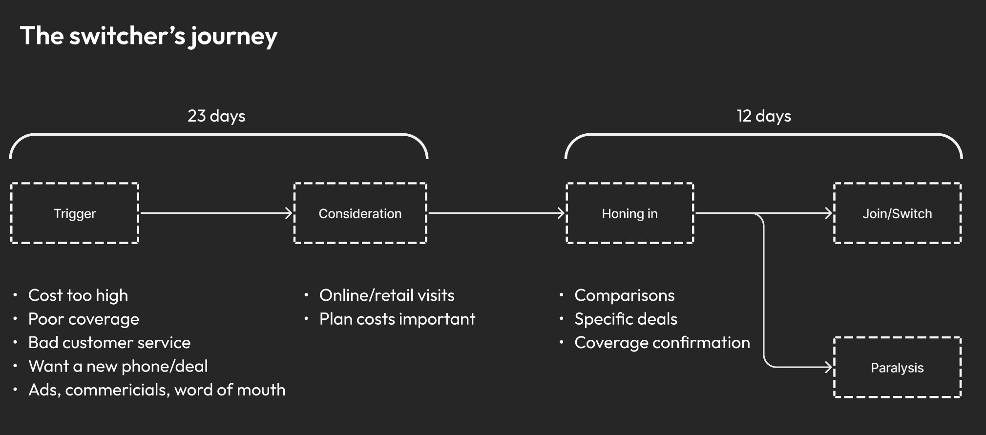
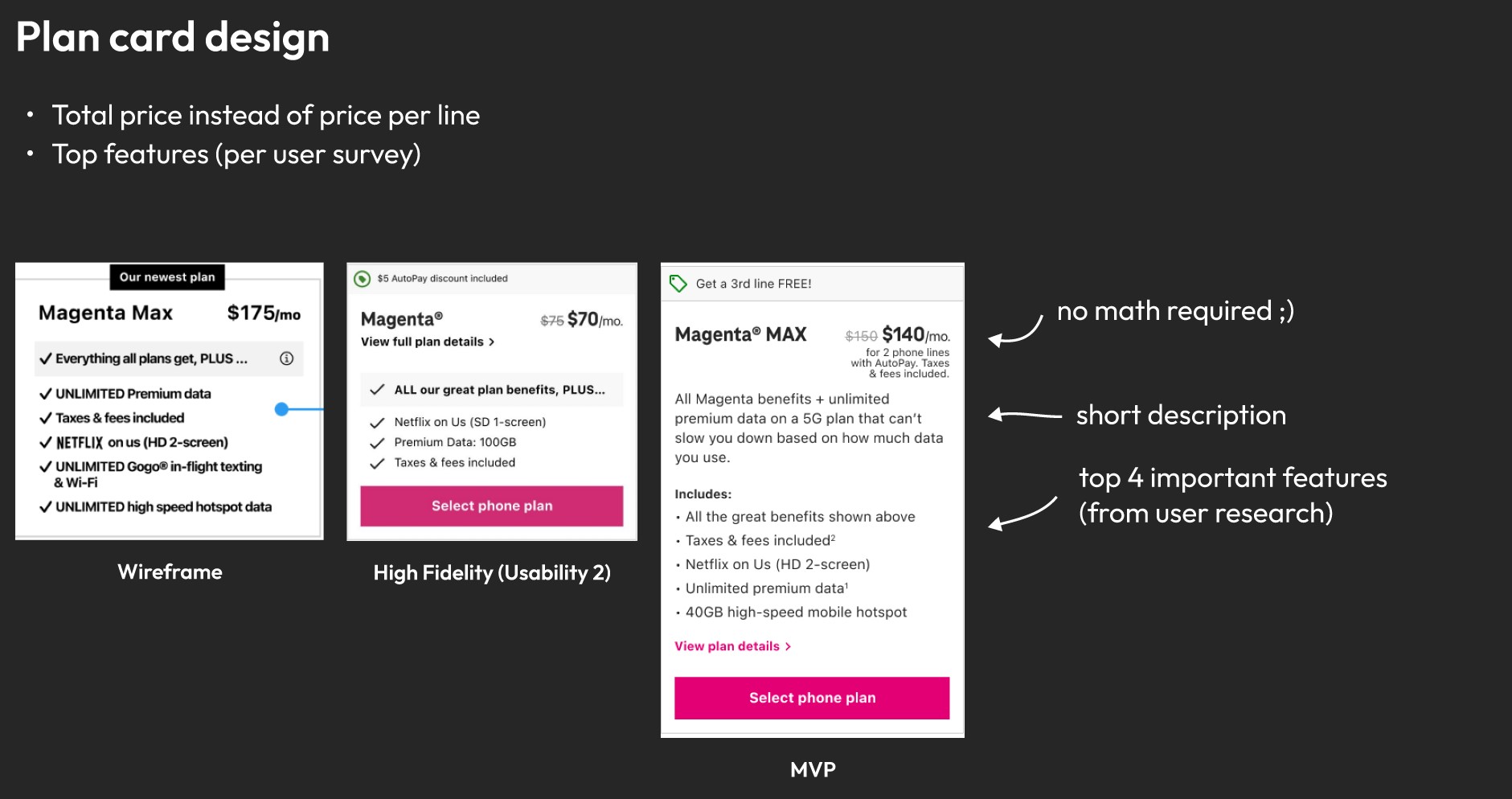
Who were the users?
From a customer survey, we knew that people looking to make the switch care most about 1) expected monthly cost, 2) plan features & information, 3) phone/device info, and 4) promo eligibility. These four pieces of information we felt would be key to place prominently in the new design. We were able to map out the customer journey by observing switcher behaviors.
Intent screen
One of the first concepts we introduced was the "Intent" page. This page let the user easily indicate how many devices they'd want to have on their plan. In our first usability study, we wanted to test the positioning of this page in two different variants:
Of the two, the test particants preferred the 'Intent after' variant, which let the customer choose their phone plan first, then add any other devices later. If they added more devices, they'd have to add a second plan for that device once they got to the cart.
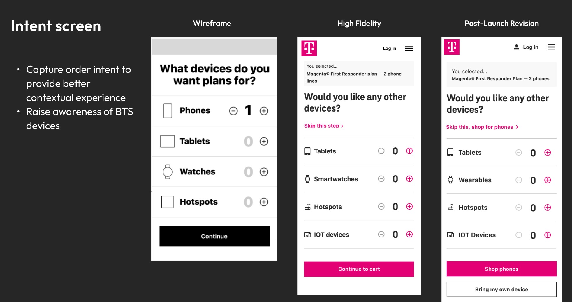
The positioning of this page was the subject of our first usability study. We had two variants, once in which you select your intent before your phone plan, and one version after the phone plan. Overwhelmingly, users preferred the second option. We revised our flow to look like this:
High-fidelity design
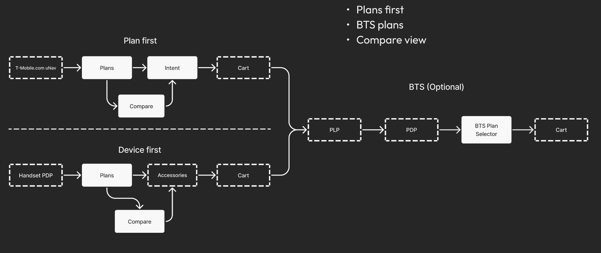
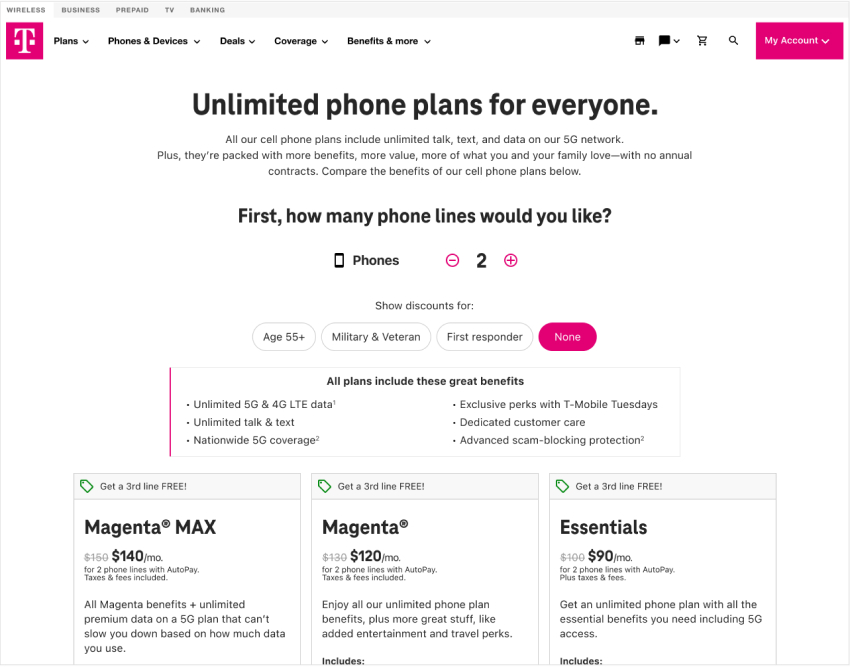
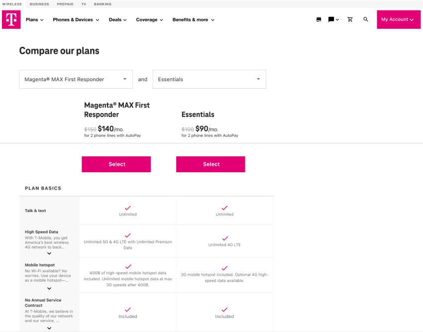
Another important aspect of this design was the plan card. We wanted to make sure the design was modular so any number of plans could be cleanly presented on the page. Total monthly cost was featured prominently, as well as a brief description and some bullet points about key plan features. For further detail, they could drill down into each plan with a comparison view.
With this design we moved to another usability study. 100% of the participants self-reported that they had completed the tasks, but only 50% actually had finished the task. Most of them, once arriving on the cart screen, assumed they were finished with the task. However, they would also need to select a BTS plan, which was an extra step that many missed.
Using research to create change
Our marketing team had a requirement that the top portion of the page be reserved for their advertisement space. However, on mobile specifically, the ads they use look like a false floor. Customers found this confusing.
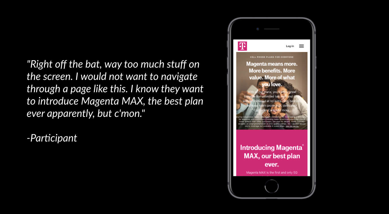
We were able to show the marketing team the video of the participants using the site and they agreed to remove the ads from that position.
Advocating for small screens
Our SEO and Marketing teams came in with a late requirement: in order to improve SEO, we'd need to include a paragraph of text about each plan on each plan card.
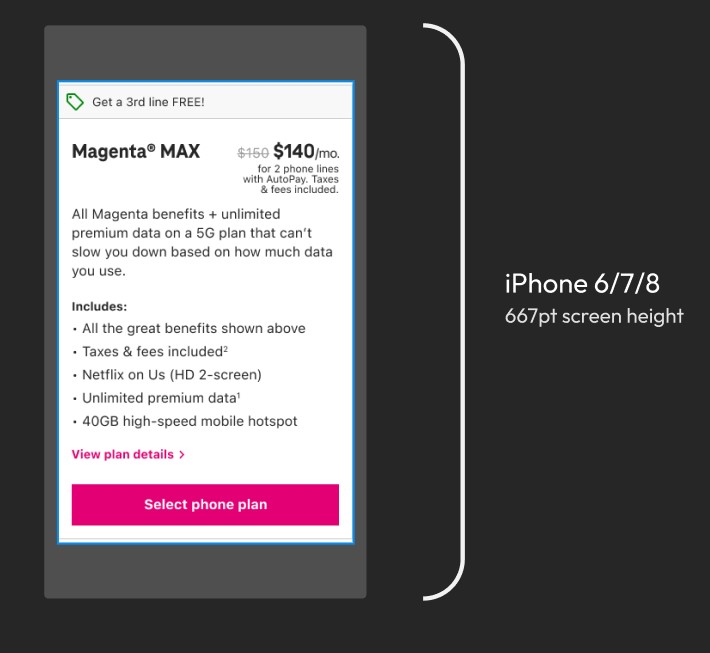
I felt introducing this text jeopardized our mobile experience, specifically on smaller devices (iPhone 8-10), which at that time represented ~10% of the customer base. I was able to convince our team to limit the length of this text to 3-4 lines with 5 plan feature bullets in order to get the design to fit on a smaller iPhone screen.
Results
When launched, metrics showed a 20% increase in attach rate for Magenta MAX, a 200% increase in daily orders, and a 30% increase in daily checkouts.
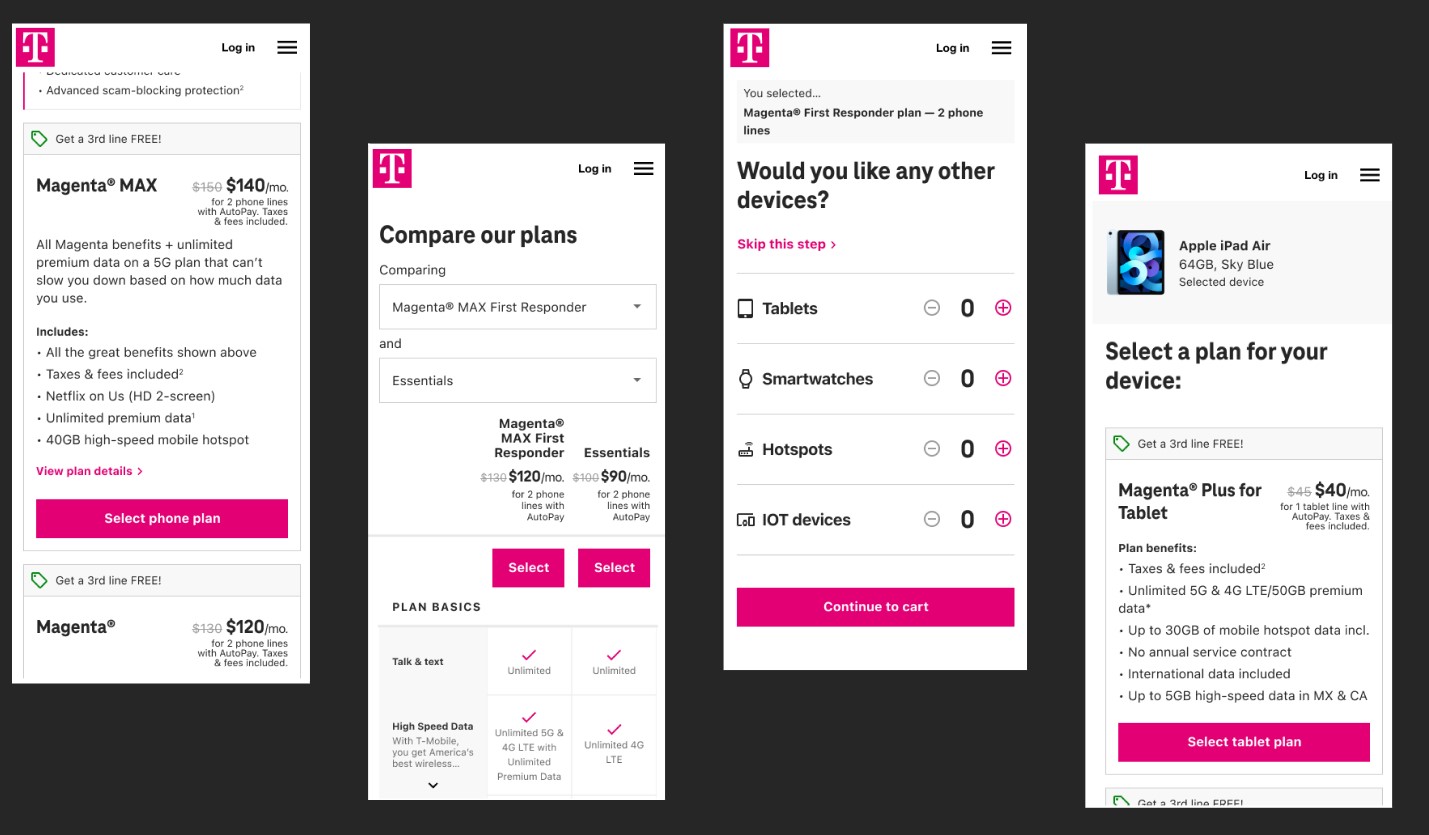
More screens
Here are some more examples from the project.