Purposeful
web_asset Webpage
Purposeful is looking to modernize the way people think about charitable giving. I was brought on as a consultant with this Bill Gates-backed startup to bring their concepts to life.
In order to secure their next round of funding, the Purposeful team had to create a prototype version of their service and acquire a net promoter score of at least 40 from potential users of the site.
Problem
Have you made a charitable donation? If you have, do you have a sense of how your money was spent? Did you get any gratitude from the beneficiaries of your gift? Chances are, your answer is no. Purposeful calls this the trust problem— the issue that your money can disappear into the ether with zero accountability— and turns it on its head.
Solution
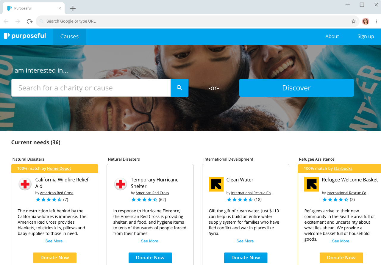
Purposeful wants to be the Amazon of charitable giving: a marketplace where users can browse & compare charities like they’re retail products. Core to creating the Purposeful experience were four pillars: a focus on outputs, corporate matching opportunities, focus on programs rather than charities, and ratings & reviews, all of which I will go into in detail.
Output focus
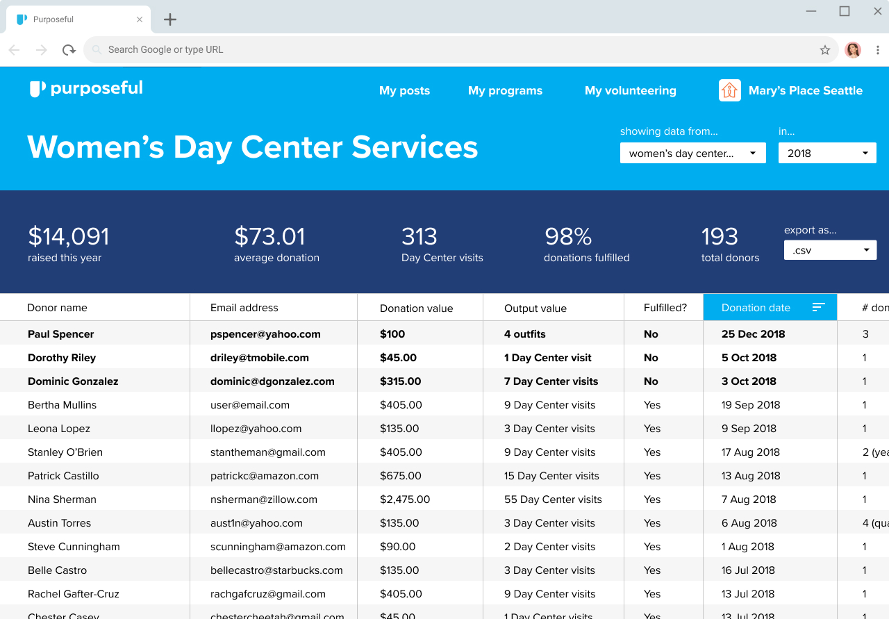
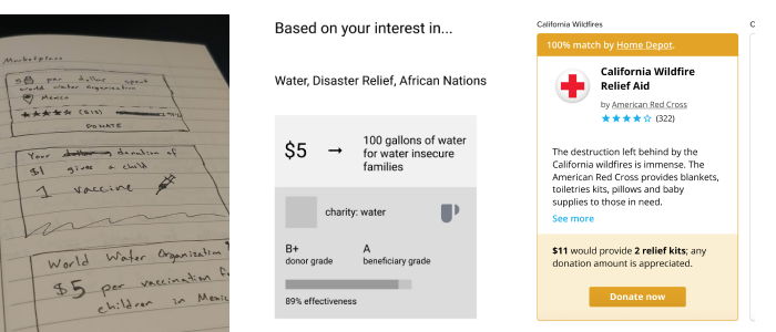
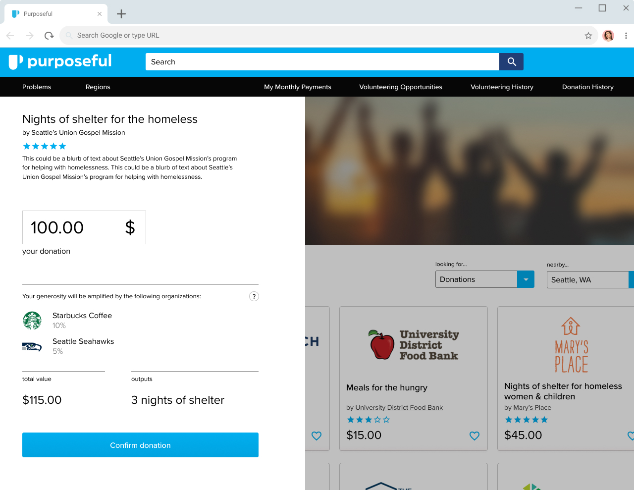
Charitable donation could become transactional. The consumer could get verification of outcome in return for their generosity: $50 provides 15 meals for the homeless, or 5 nights of shelter, or 12 vaccinations for children. These are measurable and trackable values. Increased transparency augments trust. This idea is demonstrated by receipt emails and the ability to track package deliveries online. Donations on Purposeful would produce outputs — a unit of measure for the charity to track and fulfill. Donation fulfillment would provide a receipt to the donor, and, if available, a note of gratitude from one of the beneficiaries. This idea had to be present throughout the designs— clear conveyance of information was up to me.
Ratings & reviews
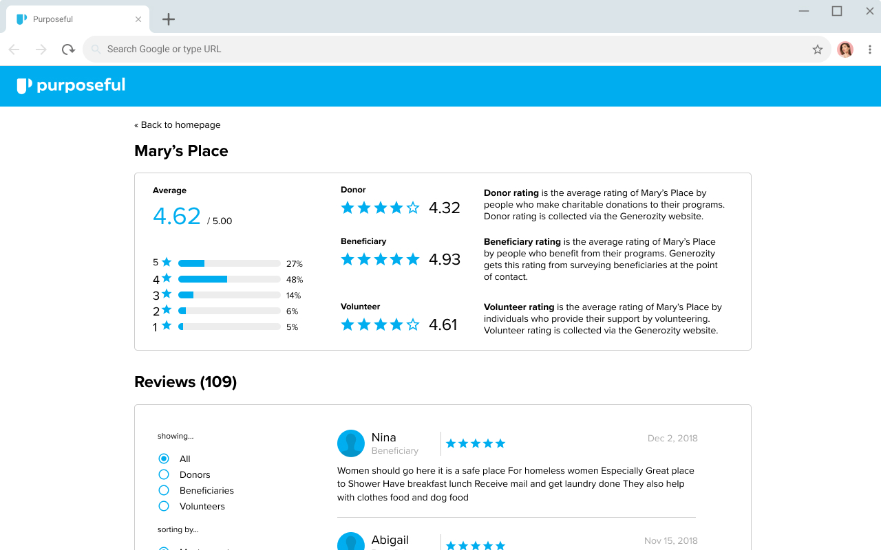
The prevailing method for gauging charity’s effectiveness in the charitable giving sector is the overhead rating — the percentage of a charity’s income that goes towards overhead (salaries, advertising, etc.) versus the percentage that goes to helping beneficiaries. Purposeful’s stance on this rating matches closely the ideas expressed by Dan Pallotta in his TED Talk in that it’s both ineffective as a rating and harmful to the industry at large.
Purposeful wants to replace the overhead rating with an average of three ratings: donor rating, which represents the experience of donors in dealing with a charity; volunteer rating, which represents the experience of individuals who volunteer to help with this organization, and beneficiary rating, which is a rating by the beneficiaries of the charity themselves. The problem I had to solve is: how can we represent these ratings to new users in a way that makes sense?
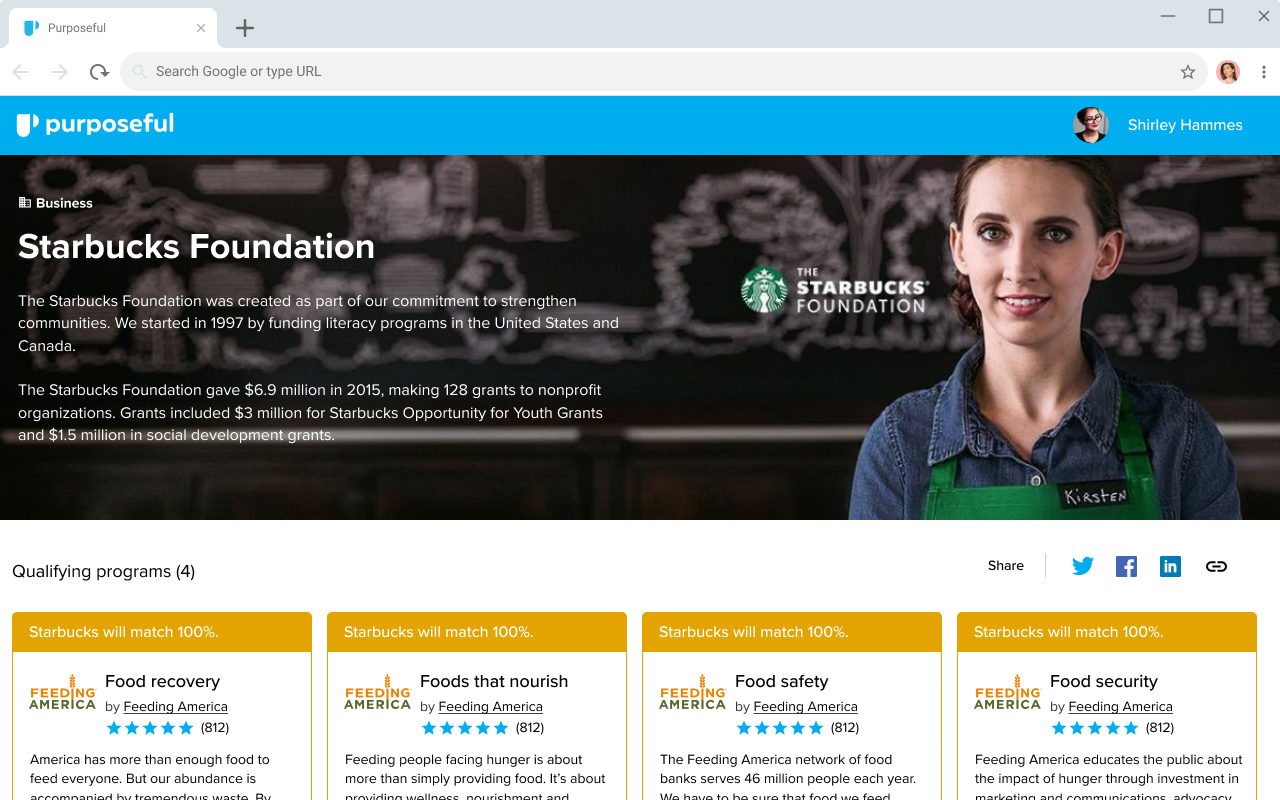
Corporate matching opportunities
How would Purposeful monetize? Taking money from charities would be unethical and counter-productive. The solution lies in corporate matching. Large corporations like Starbucks offer donation matching for their sponsored charities already— the question is whether or not they’d pay to do it through the Purposeful platform. My job was to expose the concept of matching through the UI so that users would see it and understand how they could utilize sponsorship to stretch their dollar.
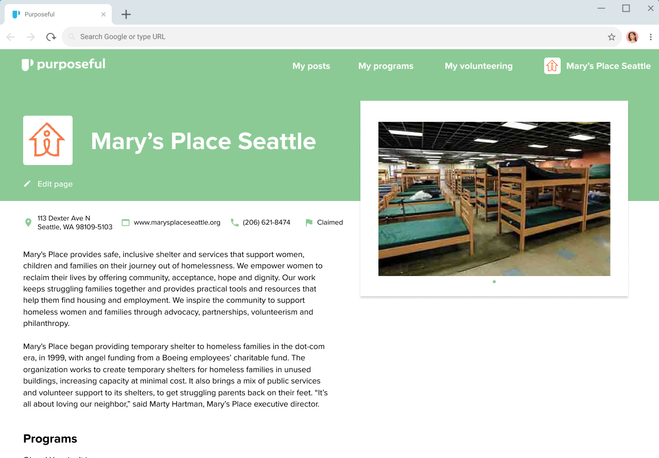
Program focus
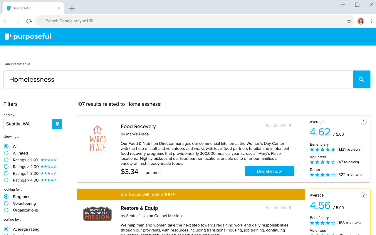
People tend to think of charities as the target of the donation — $100 to American Red Cross, $50 to Mary’s Place — but they don’t necessarily think about how that money will be used. We wanted to introduce users to the concept of programs, which are individual initiatives charities put forth toward a specific purpose. As an example, check out Mary’s Place. In our marketplace, donors would be able to choose how their money would be spent by selecting programs as the recipient of their generosity, rather than a charity. In the Amazon analog, programs would become the equivalent products.
Design & iteration
I’d recently been using Figma for a lot of my own freelance work. Given little direction on tooling at the beginning of the project, I thought this was a perfect opportunity to employ it in a project setting. Figma boasts the same feature set as a program like Sketch or Adobe XD, but adds a synchronous component and allows you to take your designs anywhere, because it’s cloud based. I can’t endorse this program strongly enough.
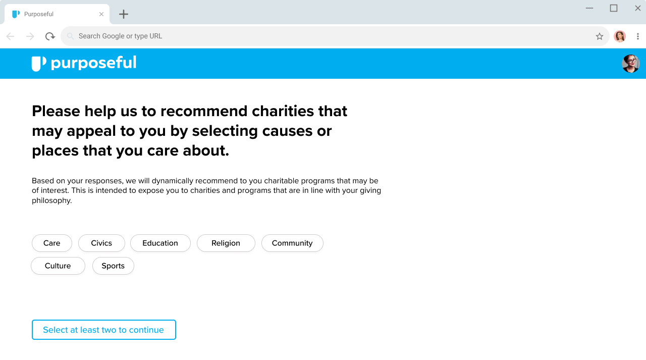
A question the design team needed to answer from the beginning was ‘What is the best way for users to engage with this content?’ We knew we needed to have a search capability so that users could find specific charities they were already aware of. What about the rest?
Luckily, there is a wealth of research already available that profiles donor behaviors. Common causes of interest are heard about on the news, like natural disaster relief. Donors are more likely to help with causes geographically closer to them, as well. We also had the idea of celebrity endorsements-- what would Oprah donate to? Would you like to donate like Oprah? That last one didn’t test particularly well, so it was scrapped.
We also wanted to test the draw of corporate sponsorship. Making UI obtrusive enough for users to notice and understand what sponsorship was all about proved to be a challenge; we went through several iterations there.
Another of the key questions I needed to answer was: “Of the wealth of information we have, what is most appropriate to show on a marketplace home page?” As mentioned above, the idea of priced outputs was one of our pillars going into ideation. Just like on Amazon or any other e-commerce site, we figured price would be appropriate to show on product cards.
Our decision lead to some strange behavior in user testing. Users were confused why donations had a price tag, and they weren’t sure what that number represented. Additionally, they would start shopping for programs based on which one would give them the most outputs per dollar, which is not a behavior we felt was constructive. Programs with high expenses per output would be ignored in favor of cheaper programs that offered $3 meals. Ultimately we felt it was a better idea to not include this information on the surface.
Prototyping & testing
With the initial concept work, I had been able to utilize InVision to create simple hotspot based prototypes. However, for our high fidelity prototype, we needed something more robust. Previous experience drew me toward Justinmind. Even though the tool itself is fairly dated there are few others that match its feature set. We needed the ability to enter data and retain information between screens, which was beyond what InVision could provide.
In total, the team put together two prototypes: one for a desktop browser, and one for a mobile device. The desktop prototype was a team effort. I built the mobile prototype by myself because at that time, I was the whole design team.
Unique to this project was our ability to test a panel of users via usertesting.com. This service was new to me, and it ended up being an invaluable part of the iteration process. We tested our final prototype via user testing and through a questionnaire of users there, we achieved a very high Net Promoter score of 64. Net Promoter Score represents willingness of users to recommend Purposeful to others.
Moving forward
My contract with Purposeful concluded in February 2019 as their need UX needs had been met for the time being. The next round of funding had been secured through the results of the prototype. The team went into stealth mode after this, and I heard very little from them.
More screens
Here are some more examples from the project.