Microsoft 365 Quiz
desktop_windows Desktop Application, Windows 10
Microsoft Ignite is an annual convention that showcases the bright minds behind Microsoft’s ideas.
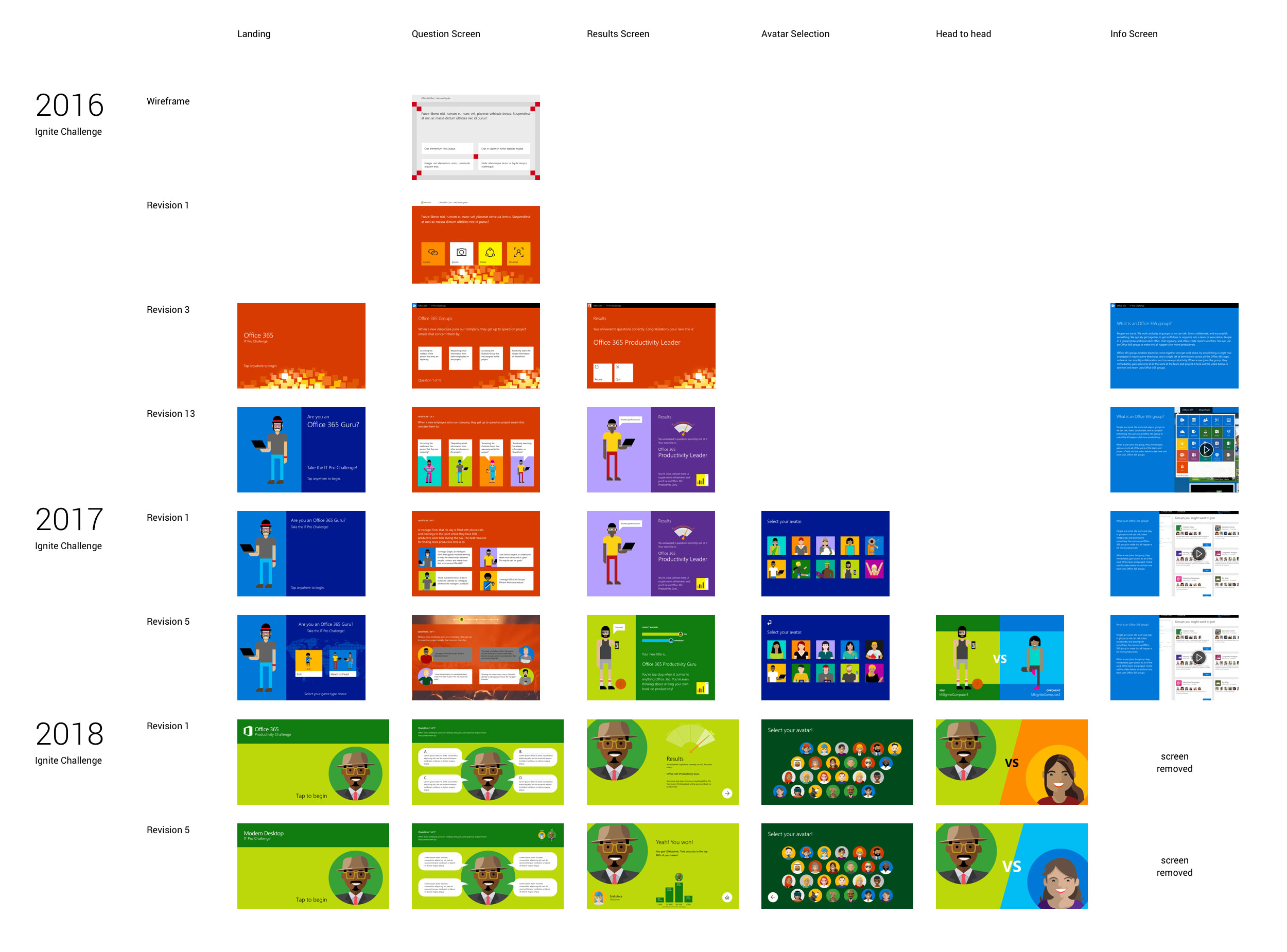
Two years ago, I designed a quiz application for the Ignite showfloor that would put attendees’ Office 365 knowledge to the test. Now, in 2018, I was given the chance to iterate on my past designs and provide the ultimate head-to-head quiz experience.
Problem
The client wanted users to engage with Microsoft 365 technology in a way that both stimulated interest in the product and informed them of product features. 2016's quiz had been a solo experience-- a single user walks up to a booth and tests how their knowledge stacks up against the rest of the world.
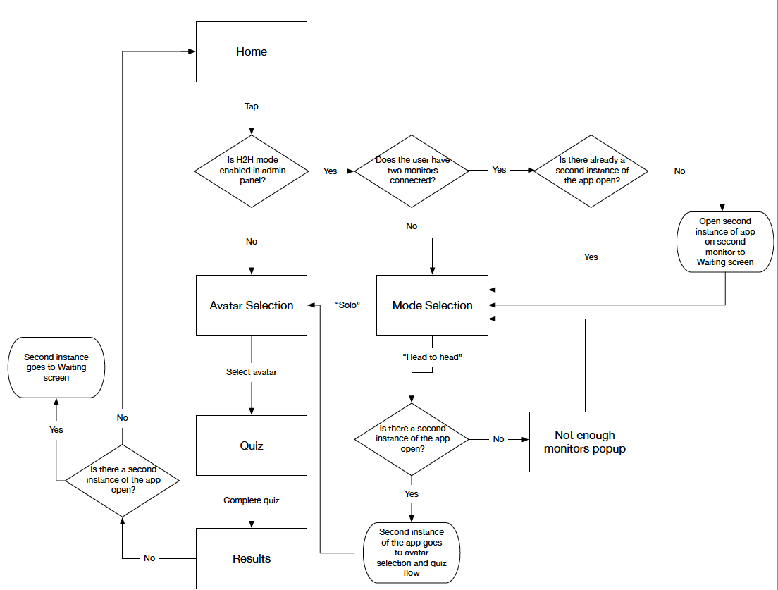
One of the original ideas from 2016 was the idea of a head-to-head mode, where two convention-goers could take the quiz simultaneously and see, between them, who emerges victorious. This head-to-head feature didn't end up making the cut for 2016 or 2017, but now with the opportunity and budget to advance the design, 2018 seemed like the perfect time to do so.
The 2016 design had ended up looking very stiff, and even though it had had some fun graphical elements, I wanted to add more motion to it to make it feel more alive. I had gained some experience with animation from previous projects, so I was eager to put my newfound skills to the test.
Areas for improvement
We noticed users who had been to the booth in previous years shared some interesting behavior. The transition pages, which used to follow each quiz question and contained textual information about each Microsoft 365 product, were largely ignored. Eyes glazed over when product videos, unskippable, and up to a minute in length, derailed their quiz experience even further.
We experienced similar complaints when we released a web-based version in 2017. While I thought these instructional videos would help the user learn about Microsoft 365, we learned that our users weren't looking to dive deep into the features of Word or Outlook.
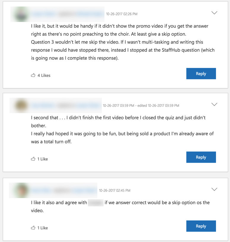
For 2018, we decided to remove all transition pages and videos, for both individual and head-to-head experiences. Instead, we wanted to focus on fast-paced, shorter questions, so that the spirit of competition wasn't lost in lengthy questions and lengthier videos.
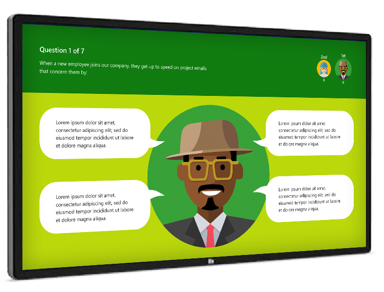
A little bit of personalization can make an experience more fun. Another new feature we had experimented with in 2017 was avatar selection. Using an updated style guide from Microsoft, we created an avatar selection feature that could distinguish a user from his or her opponent.
When a user was finished with the quiz, they'd be able to see how they stacked up against the competition. For solo players, a global average was used in comparison. Head-to-head games showed which user was triumphant over the other.
More Screens
Here are some more examples from the project.